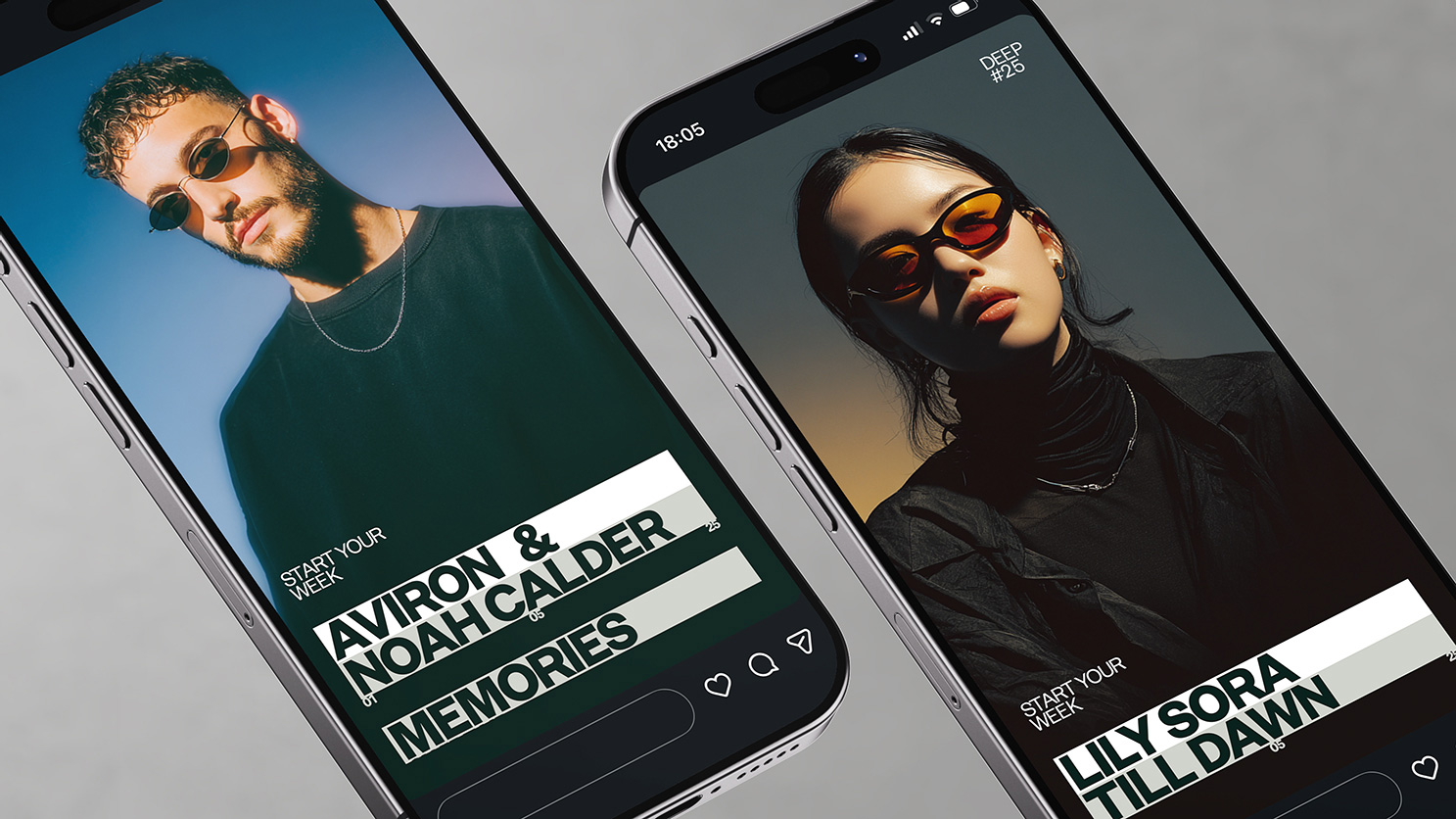
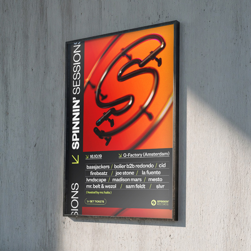
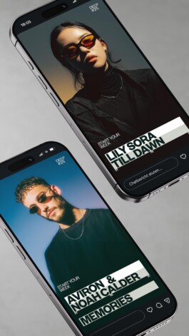


The logo was refined to improve clarity and usability, while maintaining its recognisable mark. From there, a minimal design system was developed that allowed sublabels and artists to express themselves freely, while still feeling part of a larger whole.
Rather than following the loud and expressive language of EDM, I positioned the brand as a more contemporary, established presence, forming a visual language that could hold multiple identities, as an umbrella brand, without competing with them.
Initial artwork templates, inspired by the brand’s vinyl origins, introduced a structured way of separating text and image, which evolved into a broader design system used across covers, social and campaign assets, maintaining consistency while allowing variation.
Defining Spinnin’ Deep, focussing solely on house music, allowed for a more outspoken approach, resulting in a typography-led system that stays connected to Spinnin’ while opening up a more contemporary, culturally driven look.


